Re-branding Olvi TEHO
Olvi is a Finnish brewery founded in 1878. Today, its product portfolio includes beers, ciders, hard seltzers, long drinks, cocktails, soft drinks, water, juices, sports nutrients, and energy drinks.
Results:
A rejuvenated customer base and a +5% increase in sales during the past year after re-design, with growth constantly accelerating.
Services included in the project:
Brand Architecture
Brand Identity
Packaging Design
Motion Design
Campaign Design


SOLUTION
INSIGHT
Before the re-brand, TEHO comprised two brands: TEHO Sport and TEHO energy drinks. One of the main objectives of the re-branding was to combine these two existing brands into one strong and cohesive brand. We analysed the energy drink market and positioned TEHO in a strategic cross-section based on traditional vs. progressive and low vs. high cultural capital.
APPROACH
We aimed to address two main questions:
- How do we merge the two brands while making them distinct yet recognisable as one brand?
- How do we create an effective identity system that is flexible enough to be used on a growing number of SKUs and will have a strong brand presence on store shelves?
Given the diverse consumer groups, we needed to create an identity system that served the whole brand, its sub-categories, and their respective products.
OUTCOME
We revitalised TEHO’s brand and packaging design, focusing on impact, recognisability, and a flexible design system. The dynamic logo serves as the foundation for the brand identity. It can be used as a graphic element for the primary energy drink product category. The simple yet effective dynamic bolt pattern adds momentum and, combined with a product-specific colour backdrop, simplifies product navigation and offers flexibility for creating numerous product variations. The functional energy drinks use a vibrant gradient colour backdrop combined with the pattern. At the same time, the TEHO Sport products maintain the same diagonal aesthetics, taking a more subdued sporty approach combined with slight textures developed based on the previous design.


The logo shapes can be cropped and used as a graphic element throughout identity applications.
The yellow bolt pattern is a critical element of the packaging design. The background changes according to the energy drink’s flavour and/or functionality. The sugar-free version uses the cans’ silver surface as the backdrop for the bolt pattern, creating a stripped-down design.


The TEHO energy drinks include seasonal flavour variants. They have a more expressive design approach, featuring the main ingredients illustrated on the flavour-specific bolt pattern.


The first design to reach store shelves after the re-brand was the TEHO functional energy drinks, a new product line for the brand family. These two flavour variants meet the demand for BCAA and vitamin-infused energy drinks in the fast-growing segment.

The functional energy drink takes a more complex approach to the pattern and background colour, with two separate colour gradients.


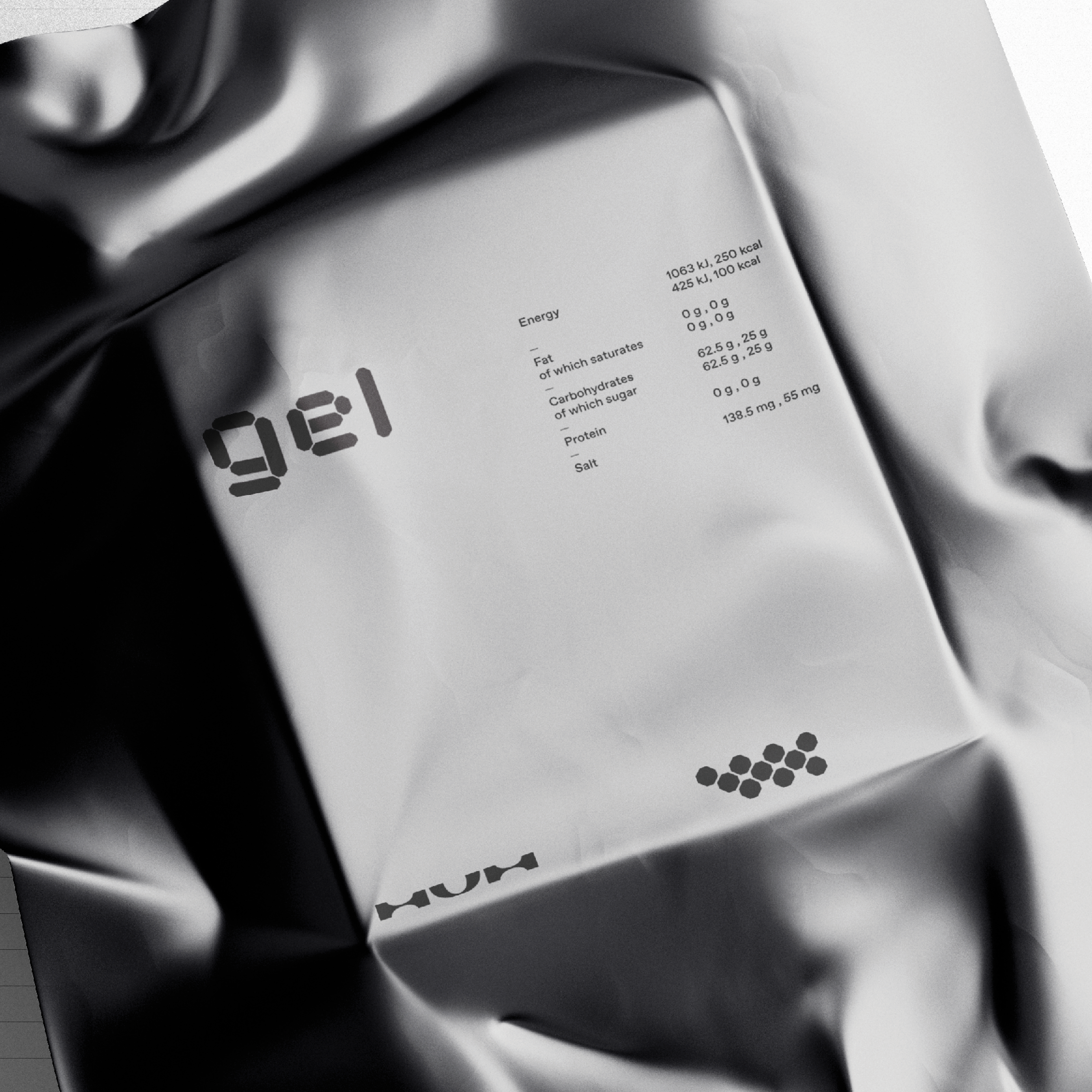
The TEHO Sport supplements maintain the same diagonal aesthetics, taking a more subdued sporty approach combined with slight textures developed based on the previous design.


Re-branding Olvi TEHO
Olvi is a Finnish brewery founded in 1878. Today, its product portfolio includes beers, ciders, hard seltzers, long drinks, cocktails, soft drinks, water, juices, sports nutrients, and energy drinks.
Before the re-brand, TEHO comprised two brands: TEHO Sport and TEHO energy drinks. One of the main objectives of the re-branding was to combine these two existing brands into one strong and cohesive brand. We analysed the energy drink market and positioned TEHO in a strategic cross-section based on traditional vs. progressive and low vs. high cultural capital.
We aimed to address two main questions:
1. How do we merge the two brands while making them distinct yet recognisable as one brand?
2. How do we create an effective identity system that is flexible enough to be used on a growing number of SKUs and will have a strong brand presence on store shelves?
Given the diverse consumer groups, we needed to create an identity system that served the whole brand, its sub-categories, and their respective products.
We successfully revitalised TEHO’s brand and packaging design, focusing on impact, recognisability, and a flexible design system. The dynamic logo serves as the foundation for the brand identity. It can be used as a graphic element for the primary energy drink product category. The simple yet effective dynamic bolt pattern adds momentum and, combined with a product-specific colour backdrop, simplifies product navigation and offers flexibility for creating numerous product variations. The functional energy drinks use a vibrant gradient colour backdrop combined with the pattern. At the same time, the TEHO Sport products maintain the same diagonal aesthetics, taking a more subdued sporty approach combined with slight textures developed based on the previous design.

We are delighted with TEHO’s brand reform. The new products have aroused significant interest and improved the brand’s attention value, rejuvenating our target group. Our sales have increased by more than 5% compared to the previous year, and this growth has constantly accelerated. Cooperation with the Kobra team has been smooth and professional; working together on this vital project has been a pleasure.
Henni Bogomoloff
Product Group Management
Olvi Oyj
Project team:
Project Lead: Tuukka Koivisto
Designer: Tuukka Koivisto, Johannes Iilahti
Motion Design: Gabriel Boicel
Illustrations: Veera Krouglov, Juulia Jokinen
Project Coordinator: Hanna Kaltiainen
Services included in project scope:
