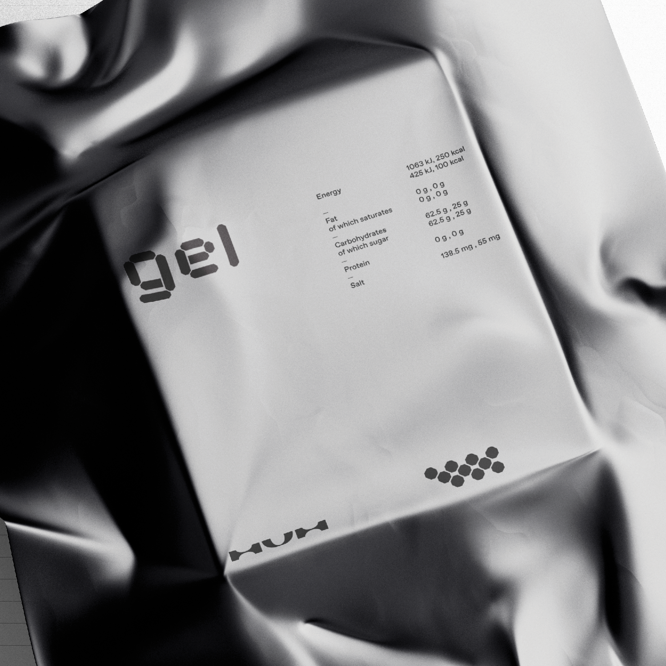
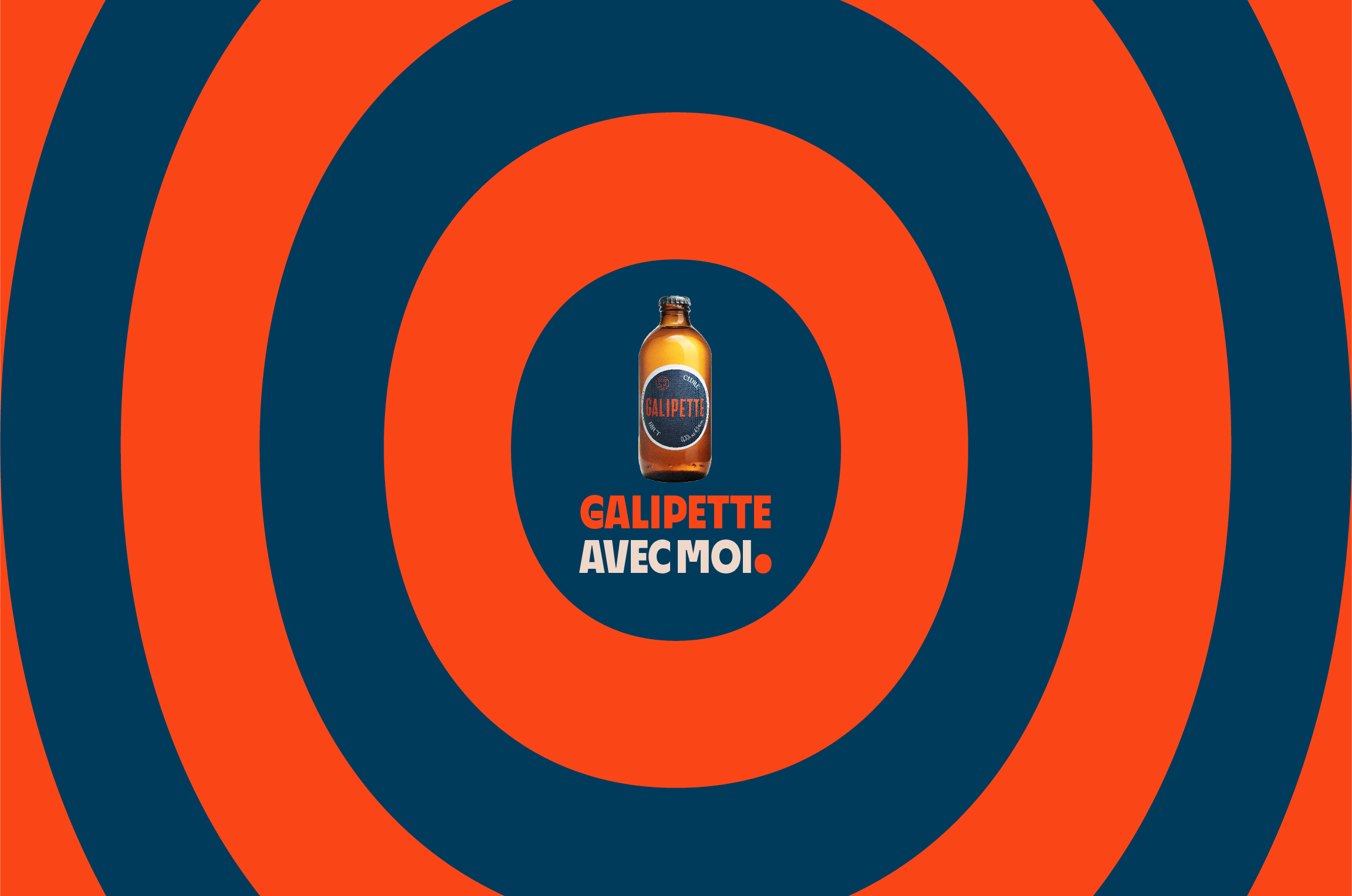
New visual look & feel for Galipette Cidre


The cider industry is dominated by large, industrially produced brands that have little to do with the subtleties of traditional cider making. However, Galipette’s ciders are made using traditional methods by local grower cooperatives in the apple-growing areas of northern France, where natural processes are kept to a minimum. Each patch of Galipette cider is unique and has a lively, complex, rich and expressive taste.
In the summer of 2023, Galipette aimed to expand into new markets and become more conscious of taste, style, and quality. To do so, they needed to update their brand identity to better challenge the corporate cider industry’s boredom while communicating natural abundance and connecting with French culture that plays with design.
Galipette was transformed into galipette, French for playful, naughty little scarecrow, prankster or somersault. The new brand concept ‘Avec moi.’ turns every cider lover into a reveller, enjoyer and playboy, much like an updated version of Romy Schneider from the movie La Piscine listening to Daft Punk’s Around The World in a space designed by M/M (Paris) along Canal Saint Martens. The new identity starts with the instantly recognizable graphic shapes and color scheme of Galipette’s glass bottles. The design aims to create a world of taste around the label, where stylish playfulness can be seen as a twinkle in the corner of the eye.
The Galipette font is a combination of traditional sign lettering, bar terrace groove, provenance, and field craftsmanship. The shape of the label is repeated in round letters, dots, etc. Round shapes such as a dot, comma, exclamation mark and question mark are turned 90 degrees to reflect the inclination of the bottle to the lips. The @ sign, on the other hand, demonstrates the pleasure brought by the cider with a witty smile and leads forward towards pleasure. The @ and G signs are good examples of simultaneous movement and stoppage in the font, a moment in the hustle and bustle of summer.
Are you interested in collaborating with us on your next project?
Please contact:
Tuukka Koivisto
Co-founder, Kobra
Project team:
Designer: Tuukka Koivisto, Jaakko Suomalainen
Project Manager: Eva Persson
Project Coordinator: Hanna Kaltiainen
Copy: Matti Pentikäinen
Photography: Olli Häkkinen and Johanna Rontu
Services included in project scope: